mirror of
https://codeberg.org/forgejo/forgejo
synced 2024-11-24 18:56:11 +01:00
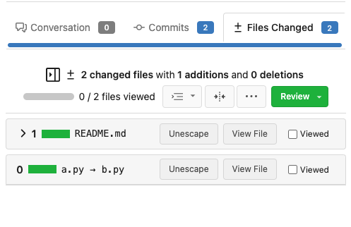
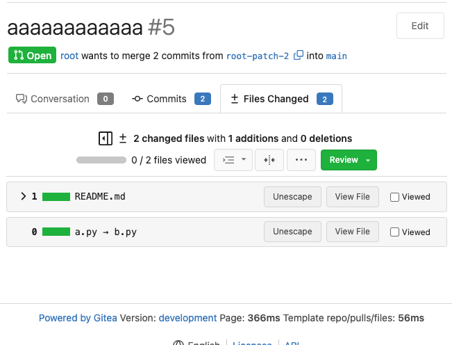
Follows #21094 Before: There are 2 problems: 1. Sometimes, the header starts with a number, sometimes, it starts with an icon button. It makes the UI look like misaligned. 2. The second item's bottom border is too thick (actually, that's an empty element with border, which should be hidden as well) 3. (An old problem) the number is not mono-font  After: Fix above problems.  --------- Co-authored-by: Lunny Xiao <xiaolunwen@gmail.com> Co-authored-by: John Olheiser <john.olheiser@gmail.com> |
||
|---|---|---|
| .. | ||
| blob_excerpt.tmpl | ||
| box.tmpl | ||
| comment_form.tmpl | ||
| comment_form_datahandler.tmpl | ||
| comments.tmpl | ||
| compare.tmpl | ||
| conversation.tmpl | ||
| csv_diff.tmpl | ||
| escape_title.tmpl | ||
| image_diff.tmpl | ||
| new_comment.tmpl | ||
| new_review.tmpl | ||
| options_dropdown.tmpl | ||
| section_code.tmpl | ||
| section_split.tmpl | ||
| section_unified.tmpl | ||
| stats.tmpl | ||
| whitespace_dropdown.tmpl | ||