mirror of
https://codeberg.org/forgejo/forgejo
synced 2024-11-27 12:16:10 +01:00
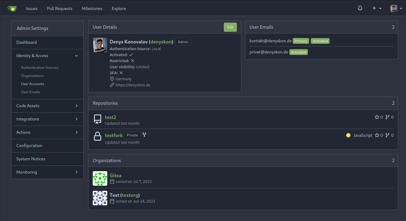
This PR implements a proposal to clean up the admin users table by
moving some information out to a separate user details page (which also
displays some additional information).
Other changes:
- move edit user page from `/admin/users/{id}` to
`/admin/users/{id}/edit` -> `/admin/users/{id}` now shows the user
details page
- show if user is instance administrator as a label instead of a
separate column
- separate explore users template into a page- and a shared one, to make
it possible to use it on the user details page
- fix issue where there was no margin between alert message and
following content on admin pages
<details>
<summary>Screenshots</summary>


</details>
Partially resolves #25939
---------
Co-authored-by: Giteabot <teabot@gitea.io>
52 lines
997 B
CSS
52 lines
997 B
CSS
.admin.hooks .list > .item:not(:first-child) {
|
|
border-top: 1px solid var(--color-secondary);
|
|
padding: 0.25rem 1rem;
|
|
margin: 12px -1rem -1rem;
|
|
}
|
|
|
|
.admin dl.admin-dl-horizontal {
|
|
padding: 1em;
|
|
margin: 0;
|
|
display: flex;
|
|
flex-wrap: wrap;
|
|
}
|
|
|
|
.admin dl.admin-dl-horizontal dt,
|
|
.admin dl.admin-dl-horizontal dd {
|
|
line-height: var(--line-height-default);
|
|
padding: 5px 0;
|
|
}
|
|
|
|
.admin dl.admin-dl-horizontal dt {
|
|
width: 300px;
|
|
max-width: calc(100% - 100px - 1em);
|
|
font-weight: var(--font-weight-semibold);
|
|
}
|
|
|
|
.admin dl.admin-dl-horizontal dd {
|
|
margin-left: auto;
|
|
width: calc(100% - 300px - 1em);
|
|
min-width: 100px;
|
|
}
|
|
|
|
.admin code,
|
|
.admin pre {
|
|
white-space: pre-wrap;
|
|
word-wrap: break-word;
|
|
}
|
|
|
|
.admin .ui.table.segment {
|
|
overflow-x: auto; /* if the screen width is small, many wide tables (eg: user list) need scroll bars */
|
|
}
|
|
|
|
.admin .table th {
|
|
white-space: nowrap;
|
|
}
|
|
|
|
.admin-responsive-columns {
|
|
display: flex;
|
|
flex-wrap: wrap;
|
|
gap: 1rem;
|
|
margin-bottom: 1rem;
|
|
}
|