mirror of
https://codeberg.org/forgejo/forgejo
synced 2024-11-28 04:36:11 +01:00
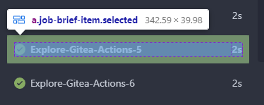
Before:  After:  In current design, the clickable area is too small, and it is hard to find the correct clickable area as the area with background color (div with class name `job-brief-item selected`) is bigger than it. --------- Co-authored-by: Giteabot <teabot@gitea.io> |
||
|---|---|---|
| .. | ||
| components | ||
| features | ||
| markup | ||
| modules | ||
| render | ||
| standalone | ||
| test | ||
| utils | ||
| webcomponents | ||
| bootstrap.js | ||
| index.js | ||
| jquery.js | ||
| svg.js | ||
| svg.test.js | ||
| utils.js | ||
| utils.test.js | ||